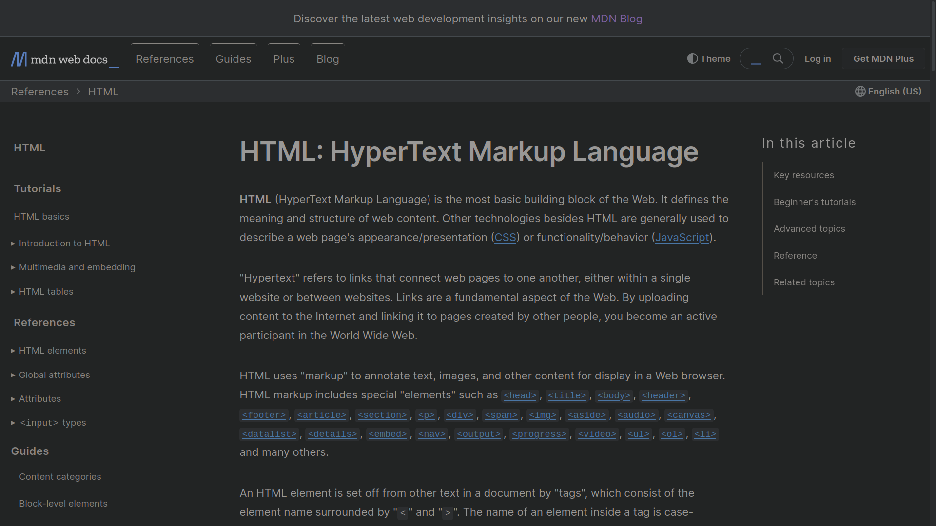
Declutter MDN v2.0


When you're exploring the MDN documentation, you often encounter ads, sidebars, and related articles that can be overwhelming and take away your attention. MDN Declutter solves this problem by stripping away all the unnecessary elements and presenting you with the main article you need. It's like having a clear path to the information you're looking for.
By removing distractions, MDN Declutter helps you stay focused on the topic at hand. You can concentrate better and absorb knowledge more effectively. It simplifies the interface and lets you dive deep into the core content without getting sidetracked. It's all about creating an environment that enhances your learning process.
Whether you're a student trying to study efficiently or a developer looking for quick references, MDN Declutter can be a valuable tool. It streamlines the MDN documentation, allowing you to learn at your own pace and focus on what matters most. It's a simple yet effective way to make the most out of your time and boost your productivity.
New feature will be added in a later update which will allow you to toggle it on or off, giving you control over your browsing experience. When activated, it cleans up the clutter and presents you with a clean reading interface. And if you prefer the original view, you can easily switch back.
Happy learning!